
Delivering an easy-to-use product for an EV sharing service
Delivering an easy-to-use product for an EV sharing service
Delivering an easy-to-use product for an EV sharing service
Delivering an easy-to-use product for an EV sharing service
Delivering an easy-to-use product for an EV sharing service
UX & UI Design
UX & UI Design
UX & UI Design
UX & UI DEsign
UX & UI Design
Project
Project
Project
Project
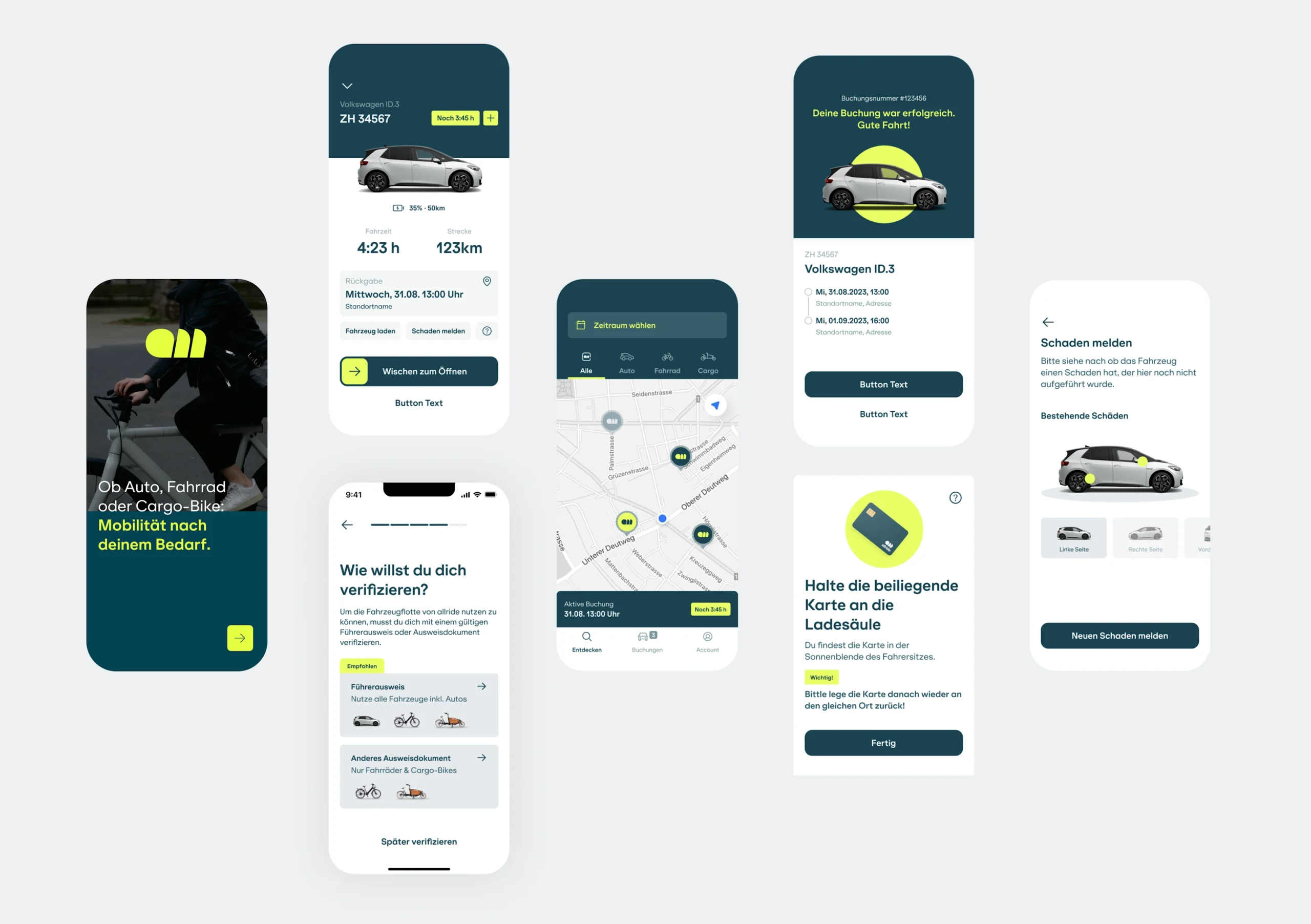
This project aimed at improving the B2C car-sharing service app. The primary focus was on enhancing the user experience (UX) and user interface (UI) of the app. Our approach coered a series of steps to revamp the app and make it more user-friendly and visually appealing.
This project aimed at improving the B2C car-sharing service app. The primary focus was on enhancing the user experience (UX) and user interface (UI) of the app. Our approach coered a series of steps to revamp the app and make it more user-friendly and visually appealing.
This project aimed at improving the B2C car-sharing service app. The primary focus was on enhancing the user experience (UX) and user interface (UI) of the app. Our approach coered a series of steps to revamp the app and make it more user-friendly and visually appealing.
This project aimed at improving the B2C car-sharing service app. The primary focus was on enhancing the user experience (UX) and user interface (UI) of the app. Our approach coered a series of steps to revamp the app and make it more user-friendly and visually appealing.
This project aimed at improving the B2C car-sharing service app. The primary focus was on enhancing the user experience (UX) and user interface (UI) of the app. Our approach coered a series of steps to revamp the app and make it more user-friendly and visually appealing.
© Edenspiekermann
© Edenspiekermann
© Edenspiekermann
© Edenspiekermann
© Edenspiekermann
UX audit & Research
UX audit & Research
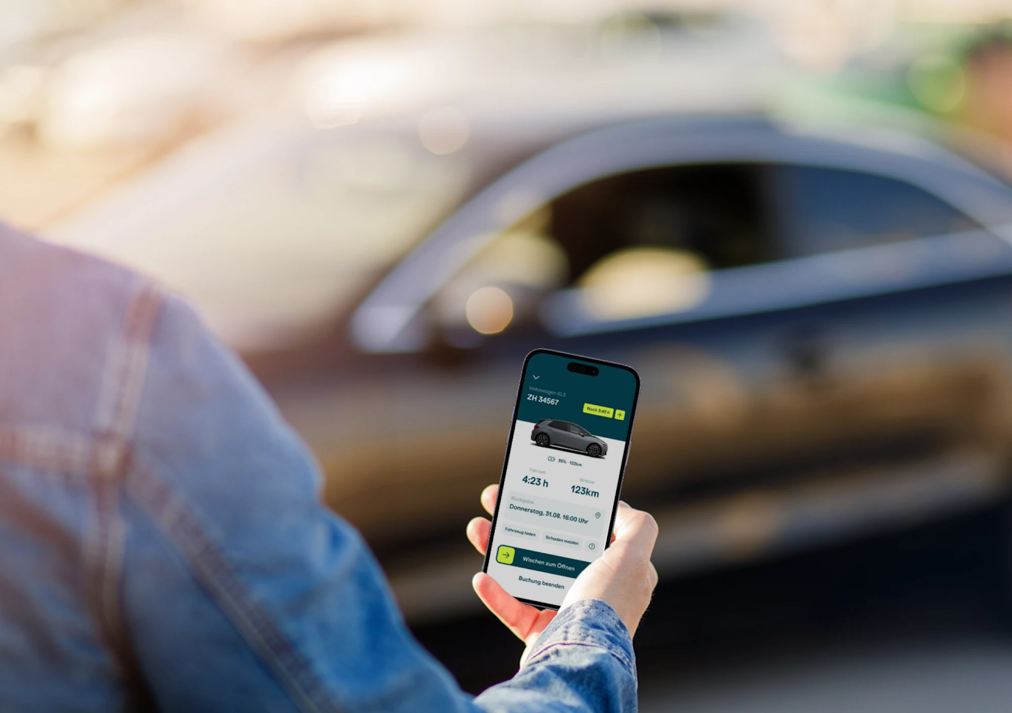
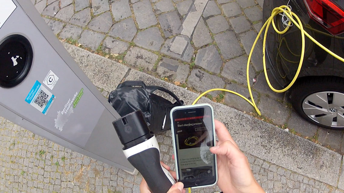
Our journey began with a comprehensive UX audit of the existing app, grounded in two key sources of insights. Firstly, we gathered user feedback from the existing app, which provided insights into user pain points and preferences. Secondly, I could conduct an extensive field research block, which involved two vital components. The first part involved thorough testing of all aspects of the client's car-sharing service, enabling us to identify its flaws and challenges. I tested multiple scenarios users could run into: driving, being over time, trying to charge the car and more. The second part included testing various other sharing apps by driving and charging the cars to draw inspiration from their user experiences.
Our journey began with a comprehensive UX audit of the existing app, grounded in two key sources of insights. Firstly, we gathered user feedback from the existing app, which provided insights into user pain points and preferences. Secondly, I conducted an extensive field research block, which involved two vital components. The first part involved thorough testing of all aspects of the client's car-sharing service, enabling us to identify its flaws and challenges. I tested multiple scenarios users could run into: driving, being over time, trying to charge the car and more. The second part included testing various other sharing apps by driving and charging the cars to draw inspiration from their user experiences.
Our journey began with a comprehensive UX audit of the existing app, grounded in two key sources of insights. Firstly, we gathered user feedback from the existing app, which provided insights into user pain points and preferences. Secondly, I conducted an extensive field research block, which involved two vital components. The first part involved thorough testing of all aspects of the client's car-sharing service, enabling us to identify its flaws and challenges. I tested multiple scenarios users could run into: driving, being over time, trying to charge the car and more. The second part included testing various other sharing apps by driving and charging the cars to draw inspiration from their user experiences.
Our journey began with a comprehensive UX audit of the existing app, grounded in two key sources of insights. Firstly, we gathered user feedback from the existing app, which provided insights into user pain points and preferences. Secondly, I conducted an extensive field research block, which involved two vital components. The first part involved thorough testing of all aspects of the client's car-sharing service, enabling us to identify its flaws and challenges. I tested multiple scenarios users could run into: driving, being over time, trying to charge the car and more. The second part included testing various other sharing apps by driving and charging the cars to draw inspiration from their user experiences.
Our journey began with a comprehensive UX audit of the existing app, grounded in two key sources of insights. Firstly, we gathered user feedback from the existing app, which provided insights into user pain points and preferences. Secondly, I conducted an extensive field research block, which involved two vital components. The first part involved thorough testing of all aspects of the client's car-sharing service, enabling us to identify its flaws and challenges. I tested multiple scenarios users could run into: driving, being over time, trying to charge the car and more. The second part included testing various other sharing apps by driving and charging the cars to draw inspiration from their user experiences.
© Edenspiekermann
© Edenspiekermann
© Edenspiekermann
© Edenspiekermann
© Edenspiekermann
Workshop & prioritization
Workshop & prioritization
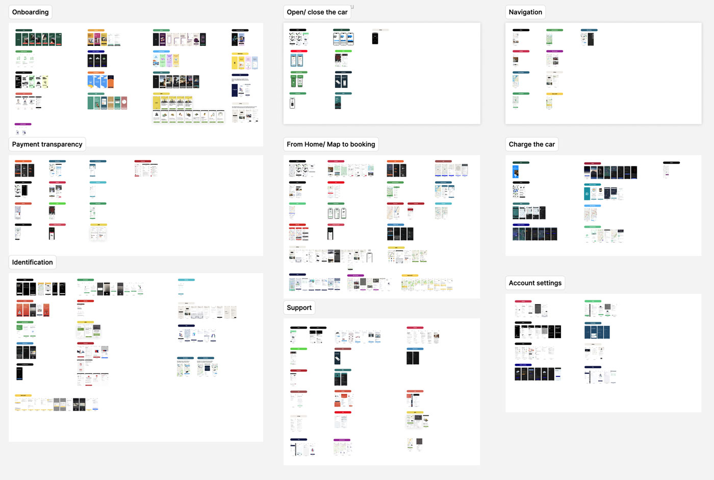
Following the research phase, we engaged in a collaborative workshop with the client. This session was instrumental in deciding which aspects of the app to tackle and the order of priority. Together with the client, we defined the areas that required immediate attention and those that could be addressed later.
In addition, we implemented a priority framework that involved sorting the different user flows based on their impact and the effort required for implementation. This framework helped us focus our efforts on the most critical aspects of the redesign.
© Edenspiekermann
© Edenspiekermann
© Edenspiekermann
© Edenspiekermann
© Edenspiekermann
Design
Design
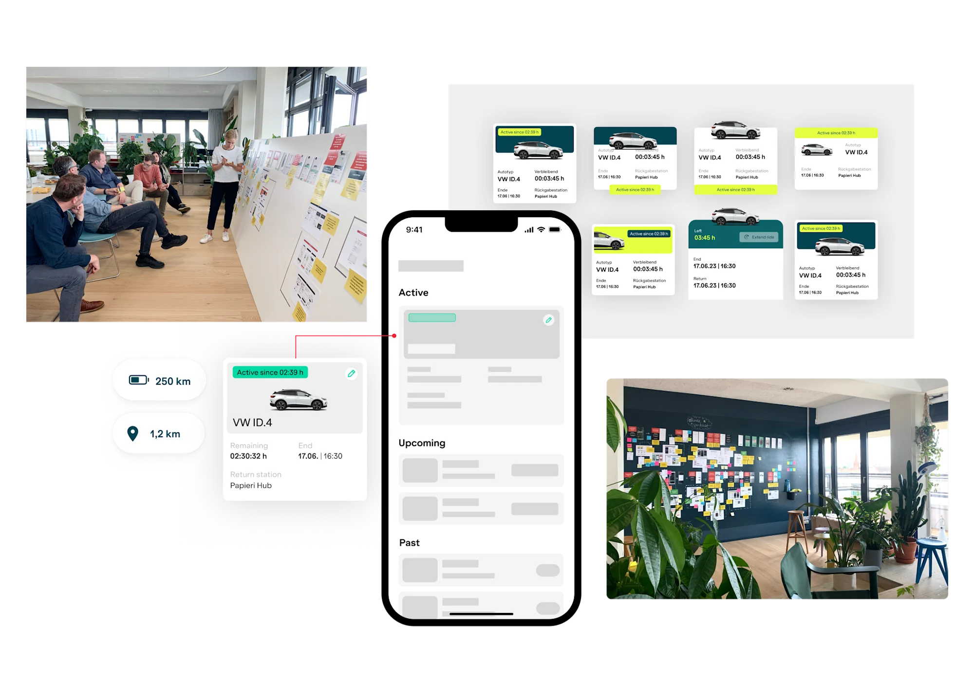
The project unfolded in two design phases: UX and UI. Initially, we tackled the UX by creating wireframes that detailed the user flows. This phase allowed us to fine-tune the functionality and ensure a seamless and intuitive user experience.
Following the UX improvements, we transitioned into the UI design phase. Here, we brought the visual elements to life, focusing on creating an appealing and user-friendly interface that aligned with the new user flows.
To ensure the sustainability and scalability of our design improvements, we constructed a token and component-based design system. The primary goal was to create a system that could be readily expanded and adapted to future requirements. This design system allowed for consistency in the app's appearance and behavior while facilitating efficient updates and iterations.
More Projects
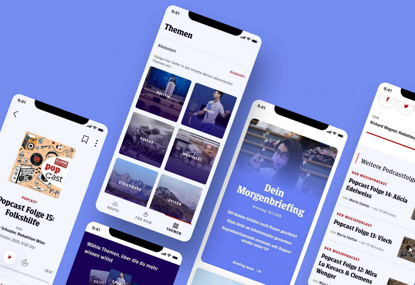
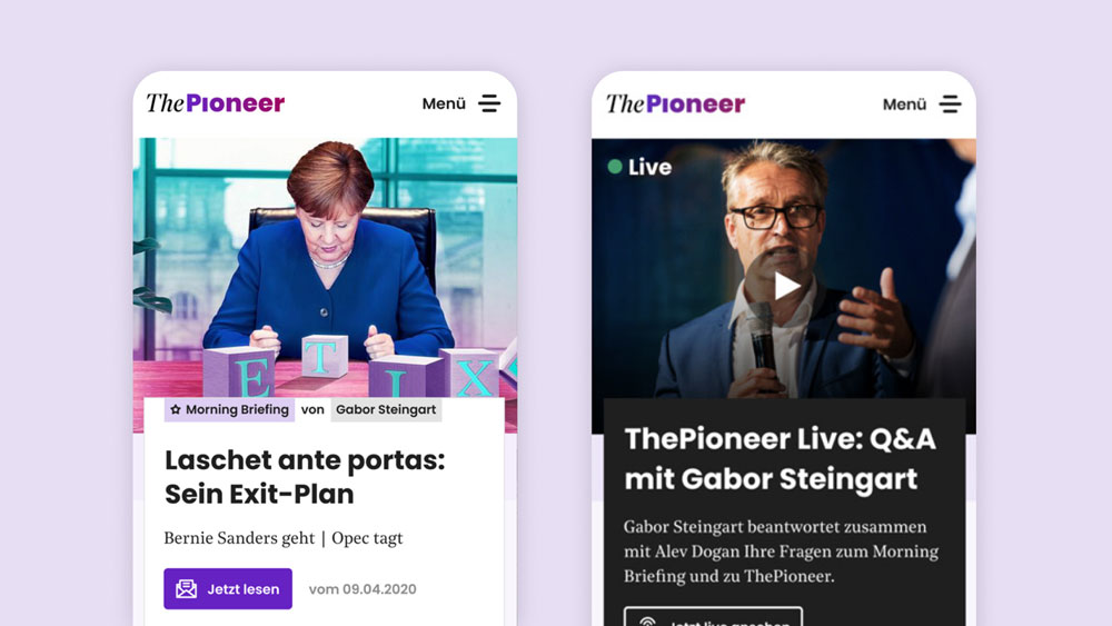
Modernizing a newspaper's digital productsApp & Website Relaunch
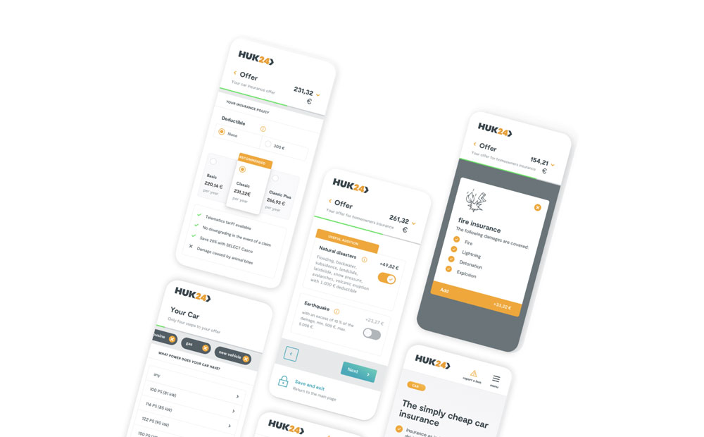
Enhancing user experience in insuranceProduct design
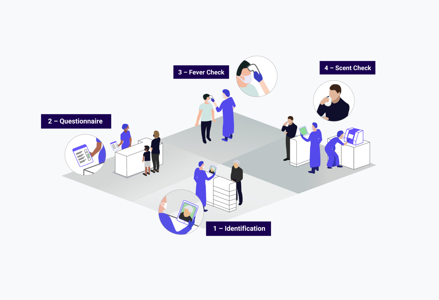
Enabling AI-based scent testing at large scaleService Design

Making home energy management accessibleProduct design
Bringing an innovative media start-up to lifeBuild Brand and Product
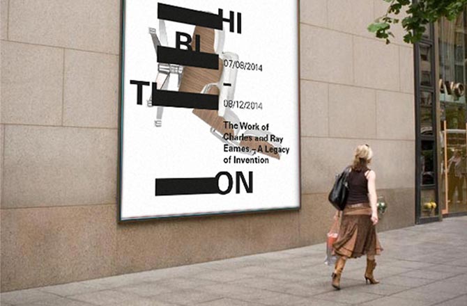
Design Museum LondonCorporate Identity
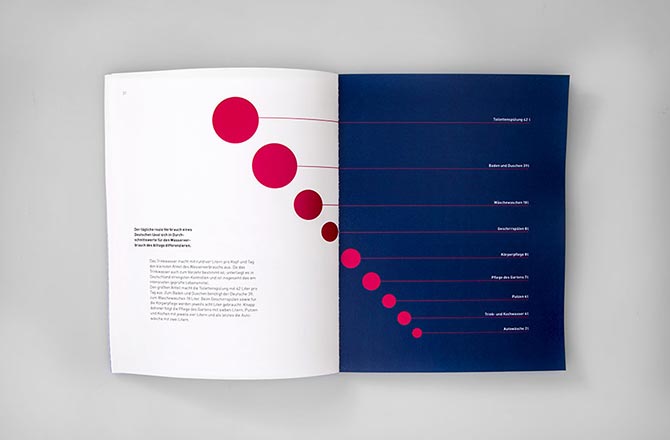
Book »Mensch und Wasser«Editorial Design
©Teresa Brand