
Design Museum London
Design Museum London
Design Museum London
Design Museum London
Design Museum London
Corporate Identity
Corporate Identity
Corporate Identity
Corporate Identity
Corporate Identity
Project
Project
Projekt
Projekt
Project
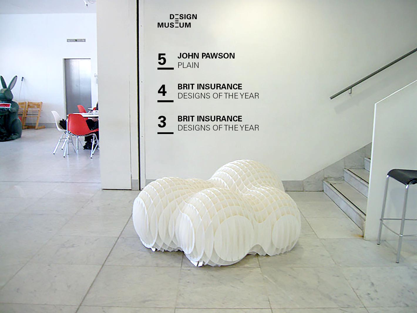
The corporate identity for the Design Museum in London emerged in the context of an official submission in 2015. During that time the museum was about to extend and looking for an identity which reflects their main categories: architecture, fashion, graphics, industrial and product design.
The corporate identity for the Design Museum in London emerged in the context of an official submission in 2015. During that time the museum was about to extend and looking for an identity which reflects their main categories: architecture, fashion, graphics, industrial and product design.
The corporate identity for the Design Museum in London emerged in the context of an official submission in 2015. During that time the museum was about to extend and looking for an identity which reflects their main categories: architecture, fashion, graphics, industrial and product design.
The corporate identity for the Design Museum in London emerged in the context of an official submission in 2015. During that time the museum was about to extend and looking for an identity which reflects their main categories: architecture, fashion, graphics, industrial and product design.
The corporate identity for the Design Museum in London emerged in the context of an official submission in 2015. During that time the museum was about to extend and looking for an identity which reflects their main categories: architecture, fashion, graphics, industrial and product design.
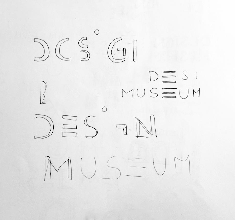
Design concept
Design concept
Design concept
Design concept
Design concept
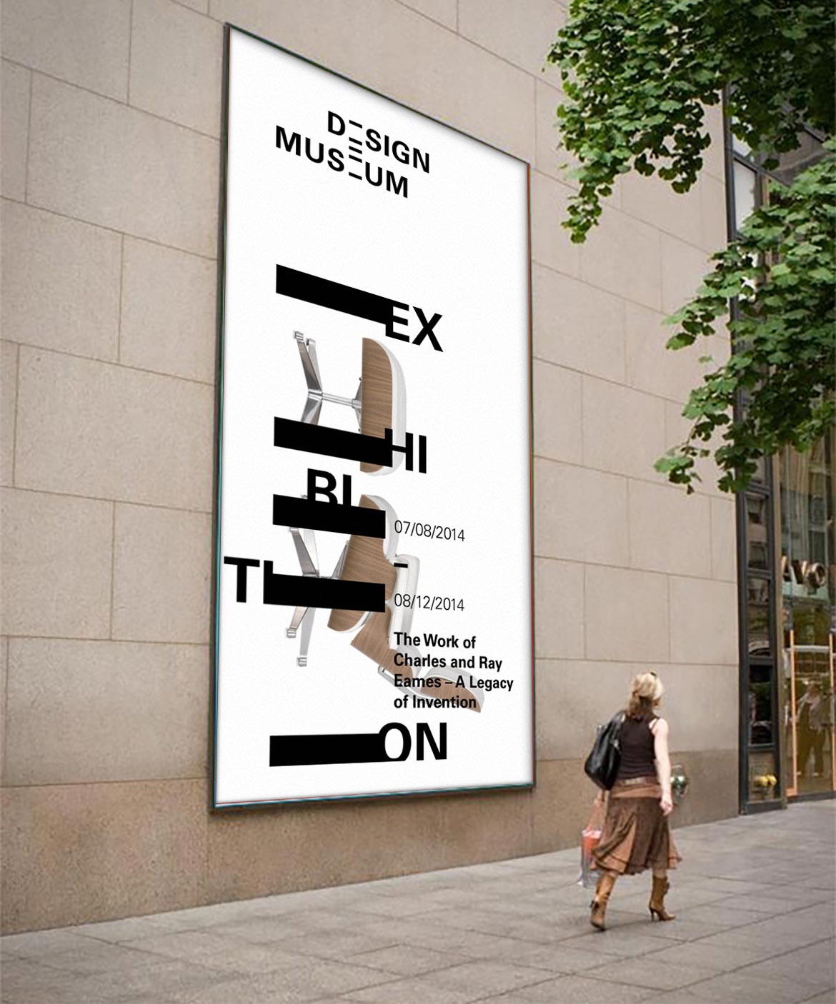
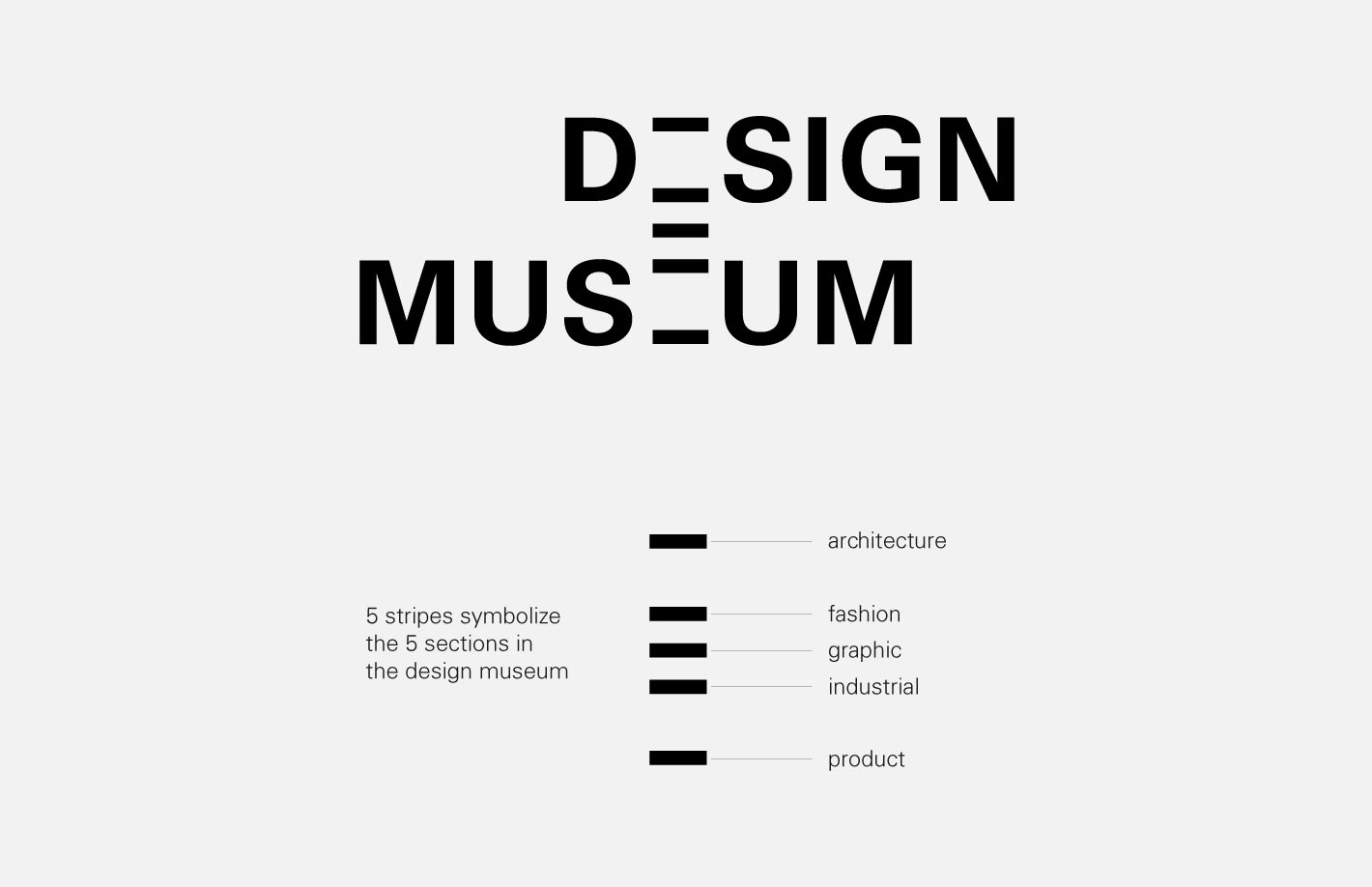
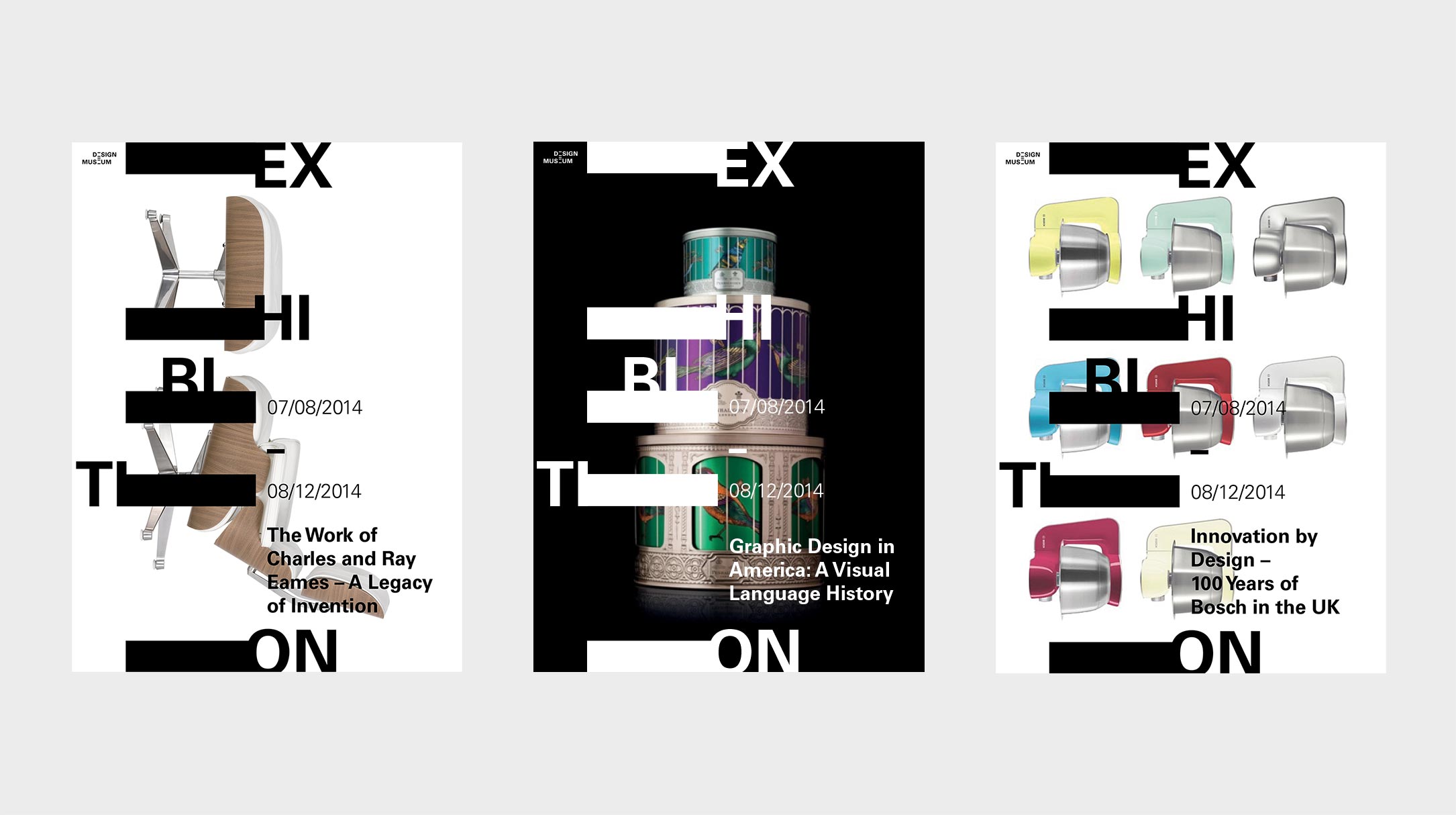
The design of the new logo for the Design Museum is timeless and minimal and weighs the different sections of the museum equally. As the vertical lines of the contained “e”s in the words are missing, the horizontal lines are being highlighted. These 5 bars symbolize the sections of the museum. They are comprised of architectural, fashion, graphic, product and industrial design. Furthermore, an “e“ appears between the two words and connects them. The new logo takes into account the longstanding reputation of the museum and stands for modernisation while the brand recognition is on purpose.
The design of the new logo for the Design Museum is timeless and minimal and weighs the different sections of the museum equally. As the vertical lines of the contained “e”s in the words are missing, the horizontal lines are being highlighted. These 5 bars symbolize the sections of the museum. They are comprised of architectural, fashion, graphic, product and industrial design. Furthermore, an “e“ appears between the two words and connects them. The new logo takes into account the longstanding reputation of the museum and stands for modernisation while the brand recognition is on purpose.
The design of the new logo for the Design Museum is timeless and minimal and weighs the different sections of the museum equally. As the vertical lines of the contained “e”s in the words are missing, the horizontal lines are being highlighted. These 5 bars symbolize the sections of the museum. They are comprised of architectural, fashion, graphic, product and industrial design. Furthermore, an “e“ appears between the two words and connects them. The new logo takes into account the longstanding reputation of the museum and stands for modernisation while the brand recognition is on purpose.
The design of the new logo for the Design Museum is timeless and minimal and weighs the different sections of the museum equally. As the vertical lines of the contained “e”s in the words are missing, the horizontal lines are being highlighted. These 5 bars symbolize the sections of the museum. They are comprised of architectural, fashion, graphic, product and industrial design. Furthermore, an “e“ appears between the two words and connects them. The new logo takes into account the longstanding reputation of the museum and stands for modernisation while the brand recognition is on purpose.
The design of the new logo for the Design Museum is timeless and minimal and weighs the different sections of the museum equally. As the vertical lines of the contained “e”s in the words are missing, the horizontal lines are being highlighted. These 5 bars symbolize the sections of the museum. They are comprised of architectural, fashion, graphic, product and industrial design. Furthermore, an “e“ appears between the two words and connects them. The new logo takes into account the longstanding reputation of the museum and stands for modernisation while the brand recognition is on purpose.
Brand element
Brand element
Brand element
Brand element
Brand element
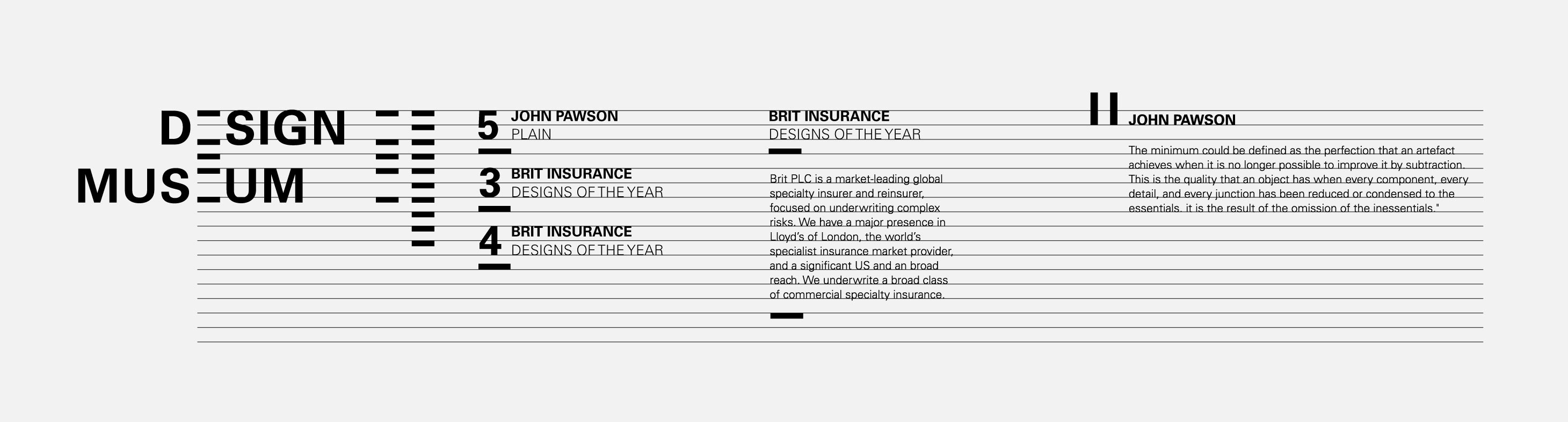
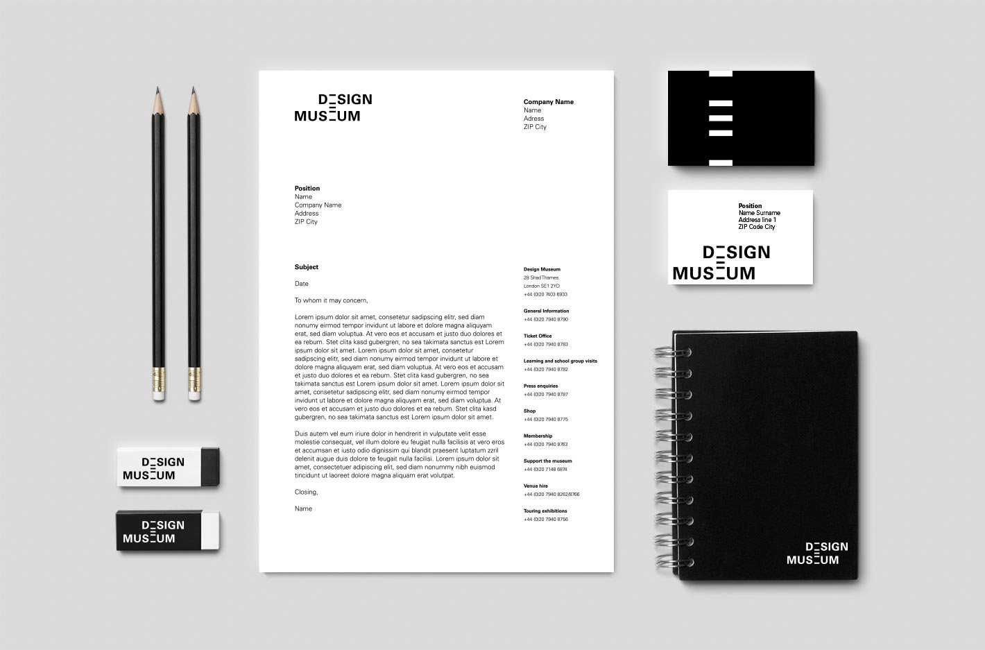
The horizontal bars of the logo are used for every medium and emphasize brand recognition. Moreover, they are used to define a typography system which includes font sizes and line heights.
The horizontal bars of the logo are used for every medium and emphasize brand recognition. Moreover, they are used to define a typography system which includes font sizes and line heights.
The horizontal bars of the logo are used for every medium and emphasize brand recognition. Moreover, they are used to define a typography system which includes font sizes and line heights.
The horizontal bars of the logo are used for every medium and emphasize brand recognition. Moreover, they are used to define a typography system which includes font sizes and line heights.
The horizontal bars of the logo are used for every medium and emphasize brand recognition. Moreover, they are used to define a typography system which includes font sizes and line heights.
Applicability
Applicability
Applicability
Applicability
Applicability
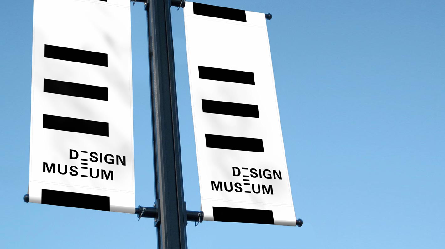
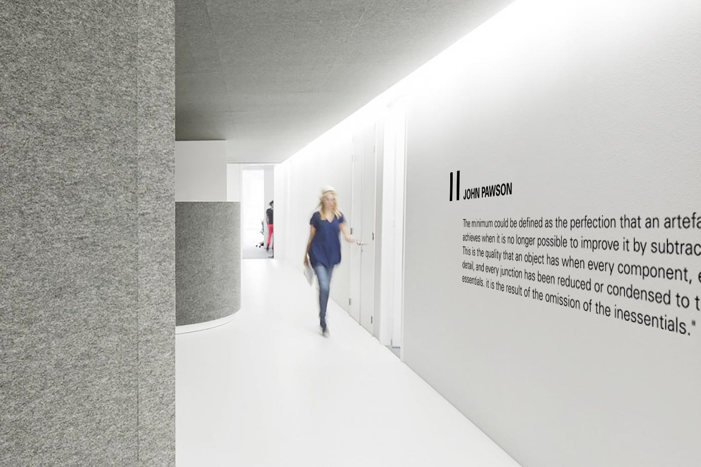
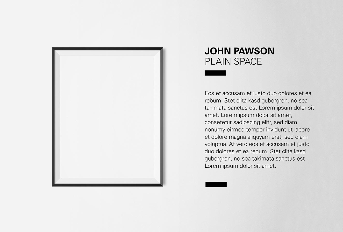
An important aspect of the design was to guarantee an optimal use in the digital but also analog context, such as the wayfinding system in the museum.
An important aspect of the design was to guarantee an optimal use in the digital but also analog context, such as the wayfinding system in the museum.
An important aspect of the design was to guarantee an optimal use in the digital but also analog context, such as the wayfinding system in the museum.
An important aspect of the design was to guarantee an optimal use in the digital but also analog context, such as the wayfinding system in the museum.
An important aspect of the design was to guarantee an optimal use in the digital but also analog context, such as the wayfinding system in the museum.
More Projects
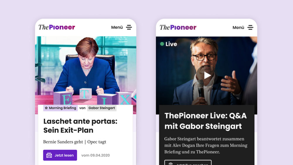
Modernizing a newspaper's digital productsApp & Website Relaunch
Enhancing user experience in insuranceProduct design


Enabling AI-based scent testing at large scaleService Design

Making home energy management accessibleProduct design
Bringing an innovative media start-up to lifeBuild Brand and Product
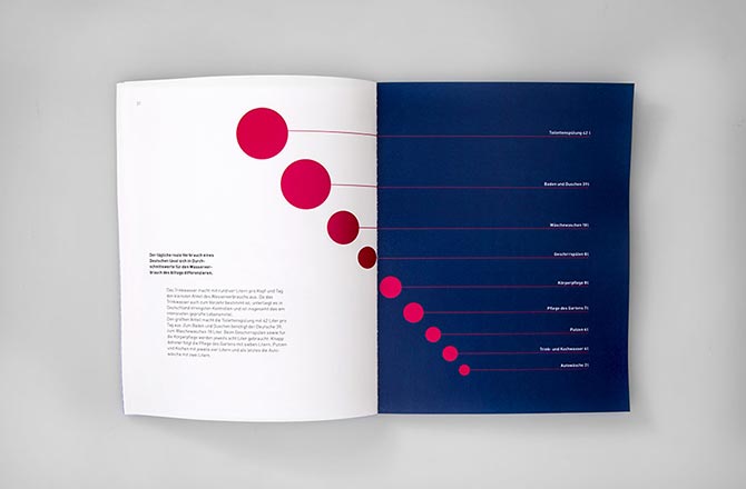
Book »Mensch und Wasser«Editorial Design
©Teresa Brand